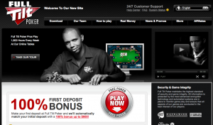
Full Tilt Poker who hasn’t really made any material changes to their website in years has gone with a radical makeover. I really like it. Clean design, enhances the brand work from their offline advertising, and gets people to the download.
Good work!

Heeey, it looks like they are doing split testing with the player on the front page. I wonder who converts the best 🙂