Full Tilt Poker released their new client today. The look at feel are updated with some new goodies thrown in.
Click on photos for larger image
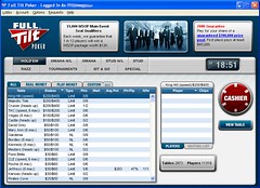
The main lobby gives a good indicator for the new look and feel.
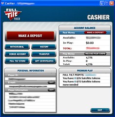
The cashier has changed up a bit too.
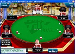
The tables now have visual timers on the avatars (see player in the 12 o’clock position for an example)
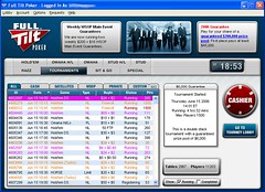
Better tournament sorting / filtering.
If you haven’t checked out the Full Tilt software recently, now seems like a pretty good time 🙂


Ugh…Why does the cashier window say “none needed”? I think Katkin effed it up.
Played on it today and the software is fine but the players are just as bad as they have always been!
All of this is useless bullshit until Kathy gets her avatar.
I second what Joe said. The tourney lobby took some getting use to. But the sort feature is nice as is the visual timer on the player.
It’s very nice. I was very discombobulated for a ffew minutes last night, however. Everything in the tournament lobby is reversed!
Congrats to all of you on a job well done, though I guess Franklin did all the work. 🙂
That’s a pretty sweet new look 🙂 I’m very happy with it!